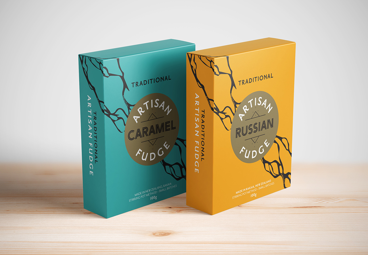
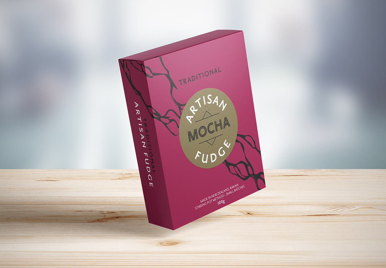
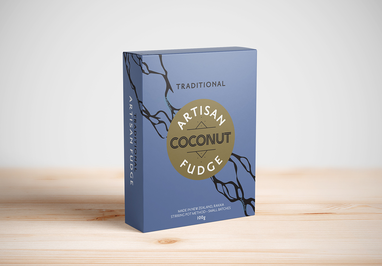
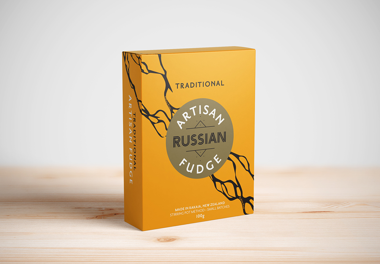
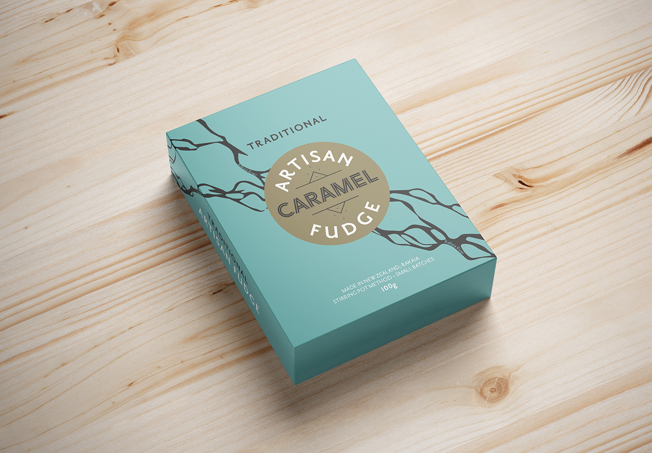
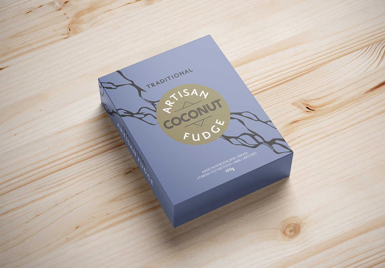
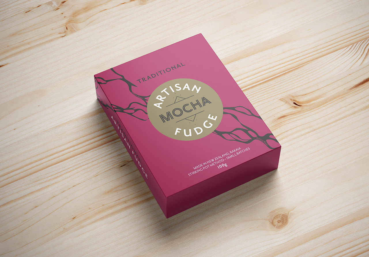
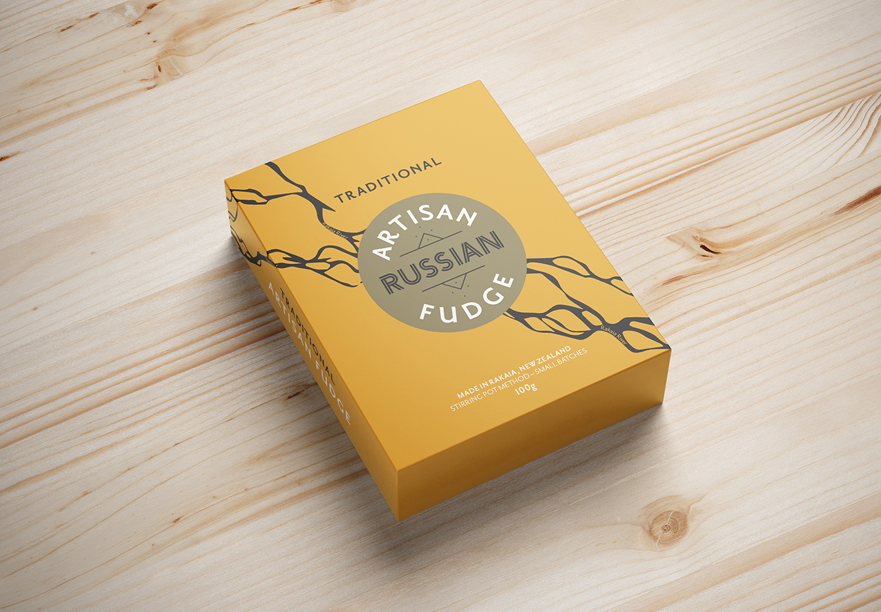
Something traditional and modern, with a hint of 1930s was the brief. A colour palette was carefully selected, and combined with fonts that fit equally with the 1930s as they do today. The braided river graphic was added to offer an element of intrigue, reflecting the river near to where the fudge is handmade, whilst also looking like the hot, raw product running off the back off the cook’s spoon.